Scope:
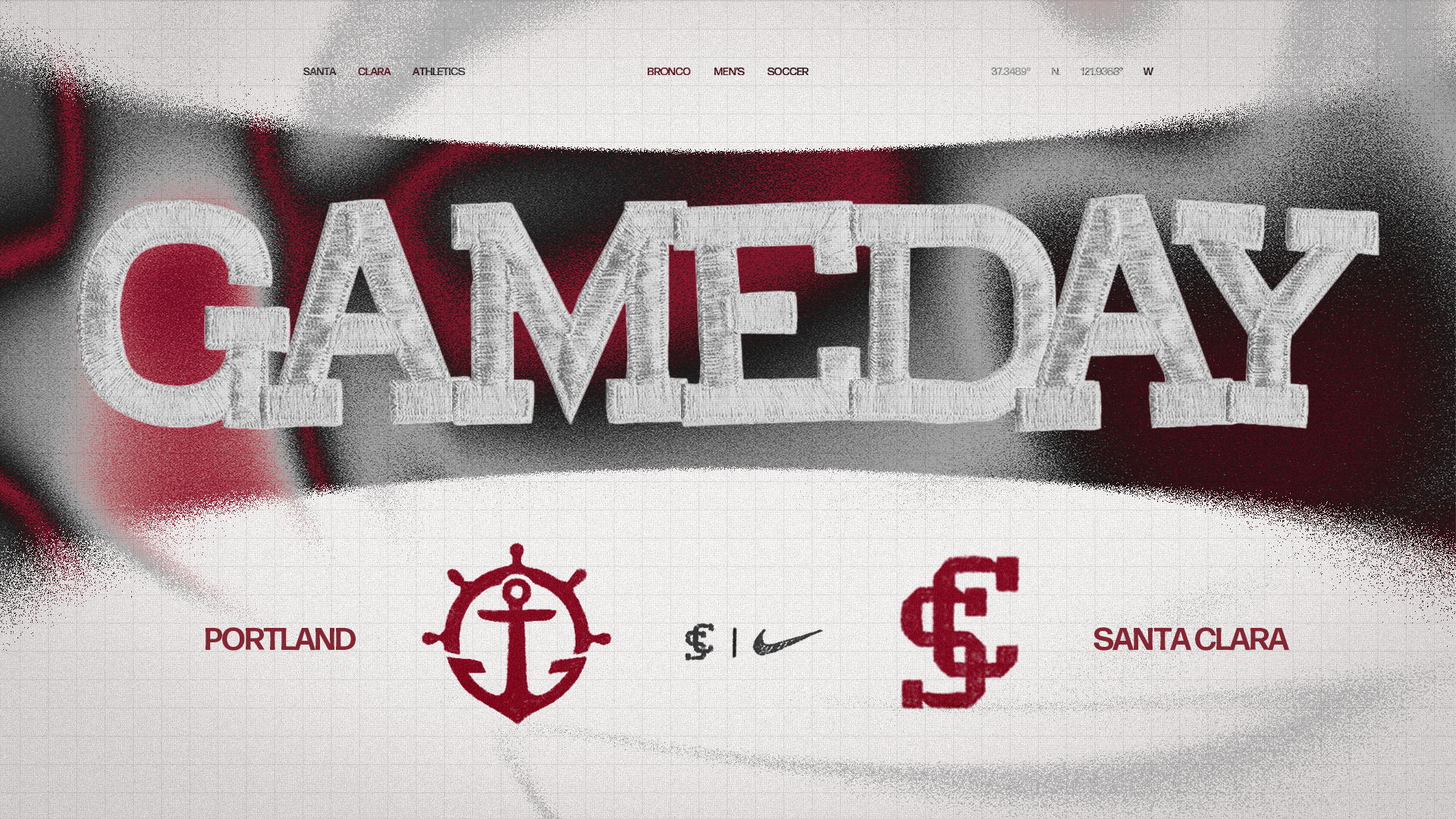
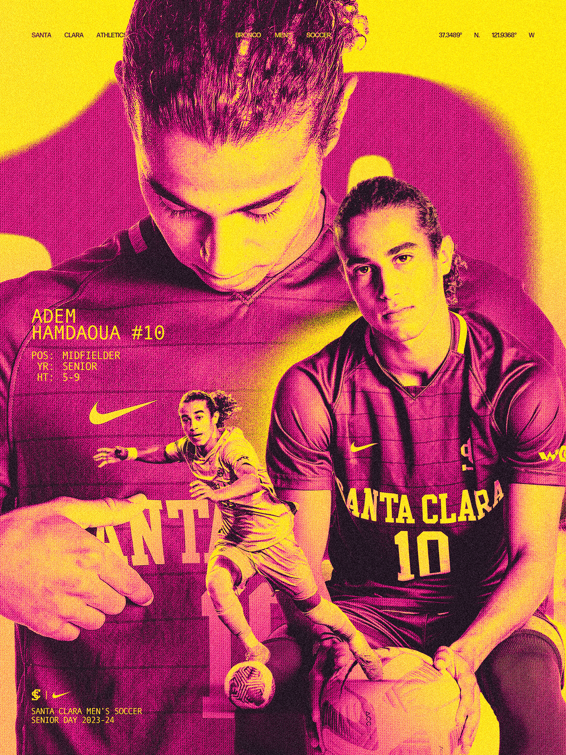
In years past, the men's soccer program at SCU had never had its own identity. SCU Athletics needed to give the team originality while staying close to the National Championship-winning women's team branding.
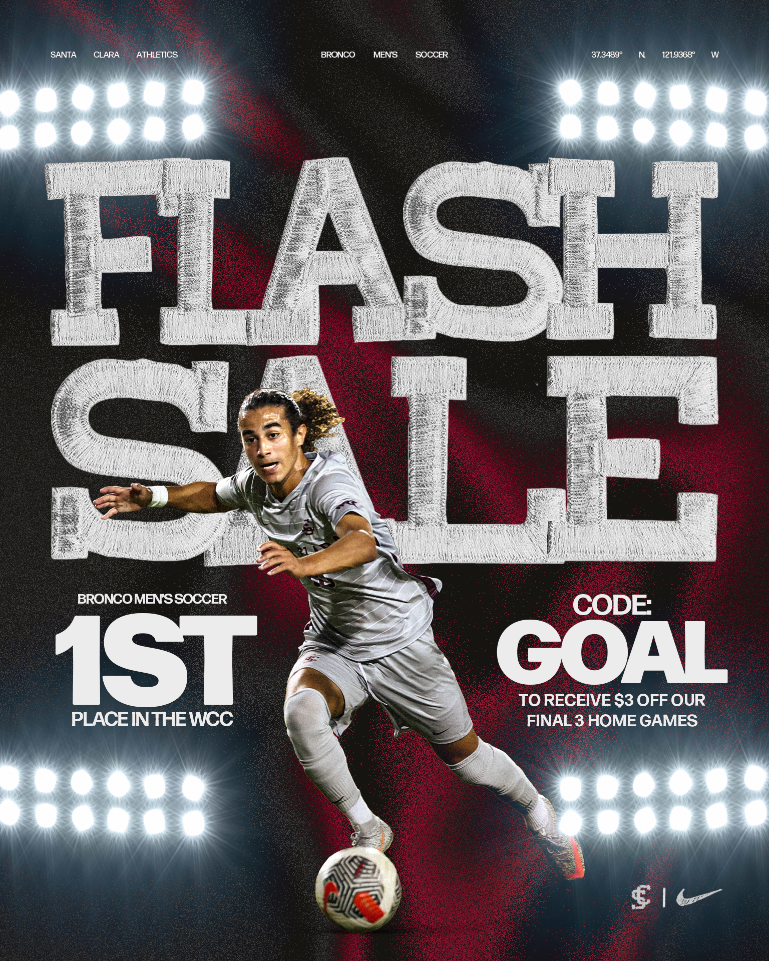
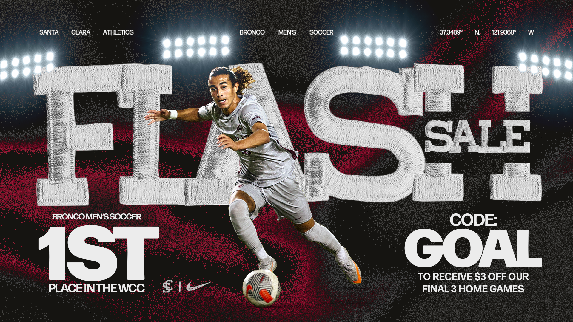
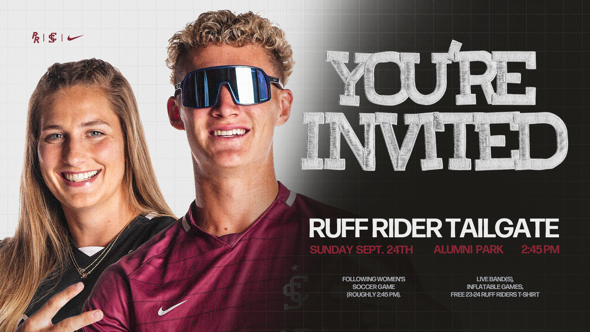
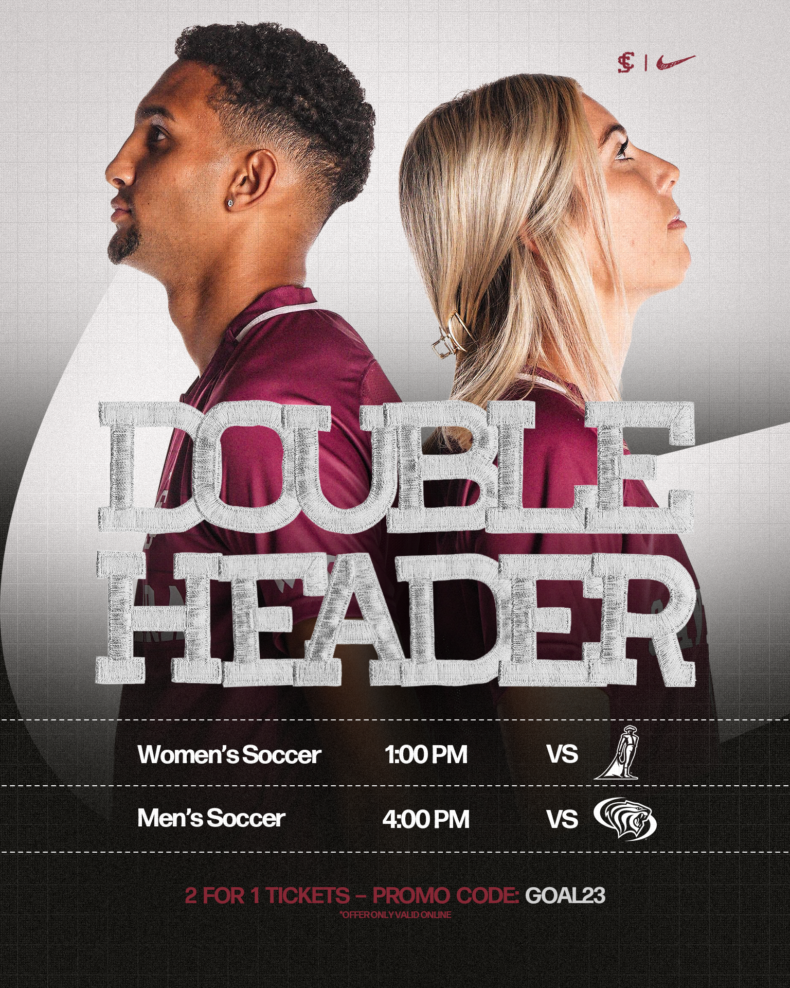
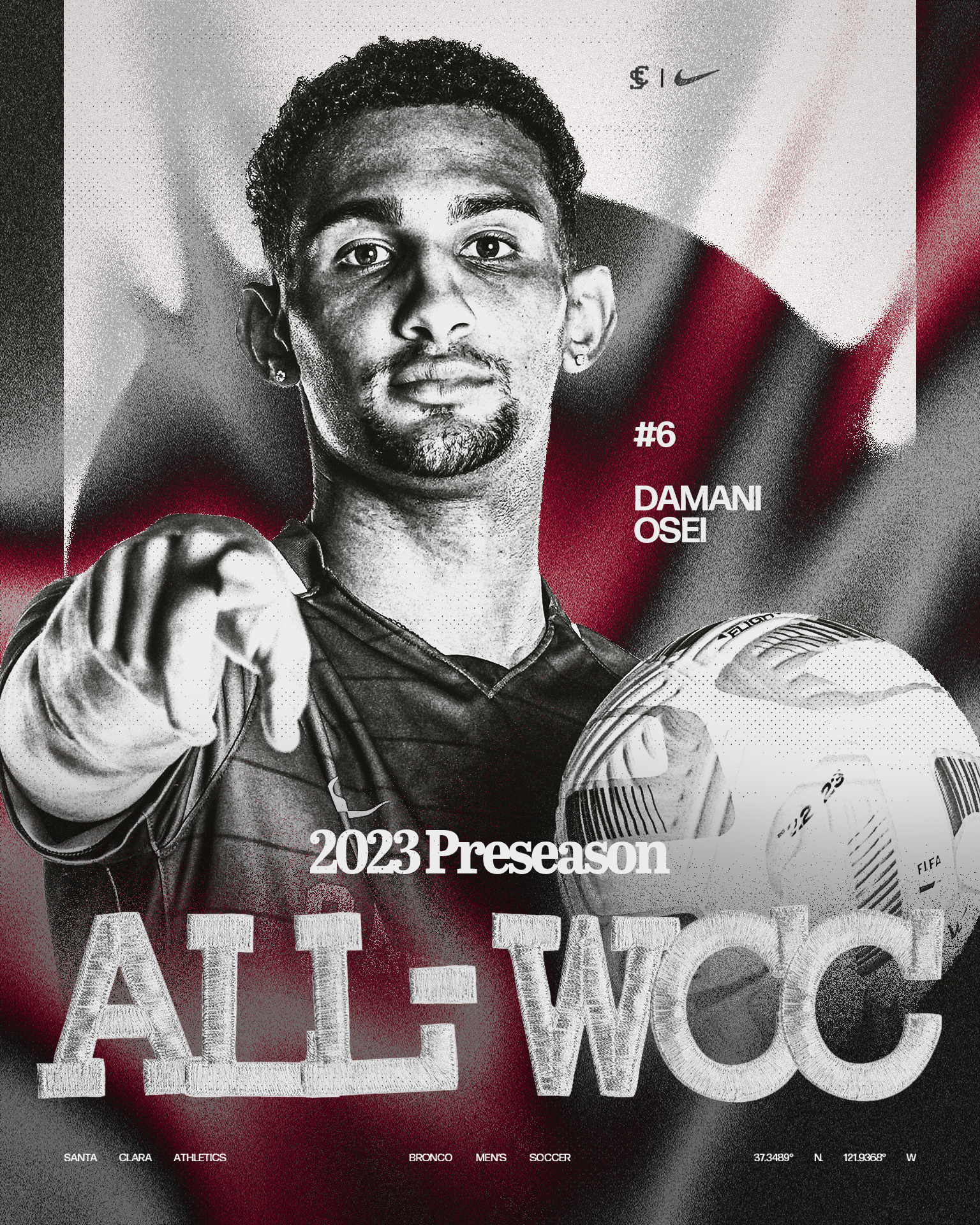
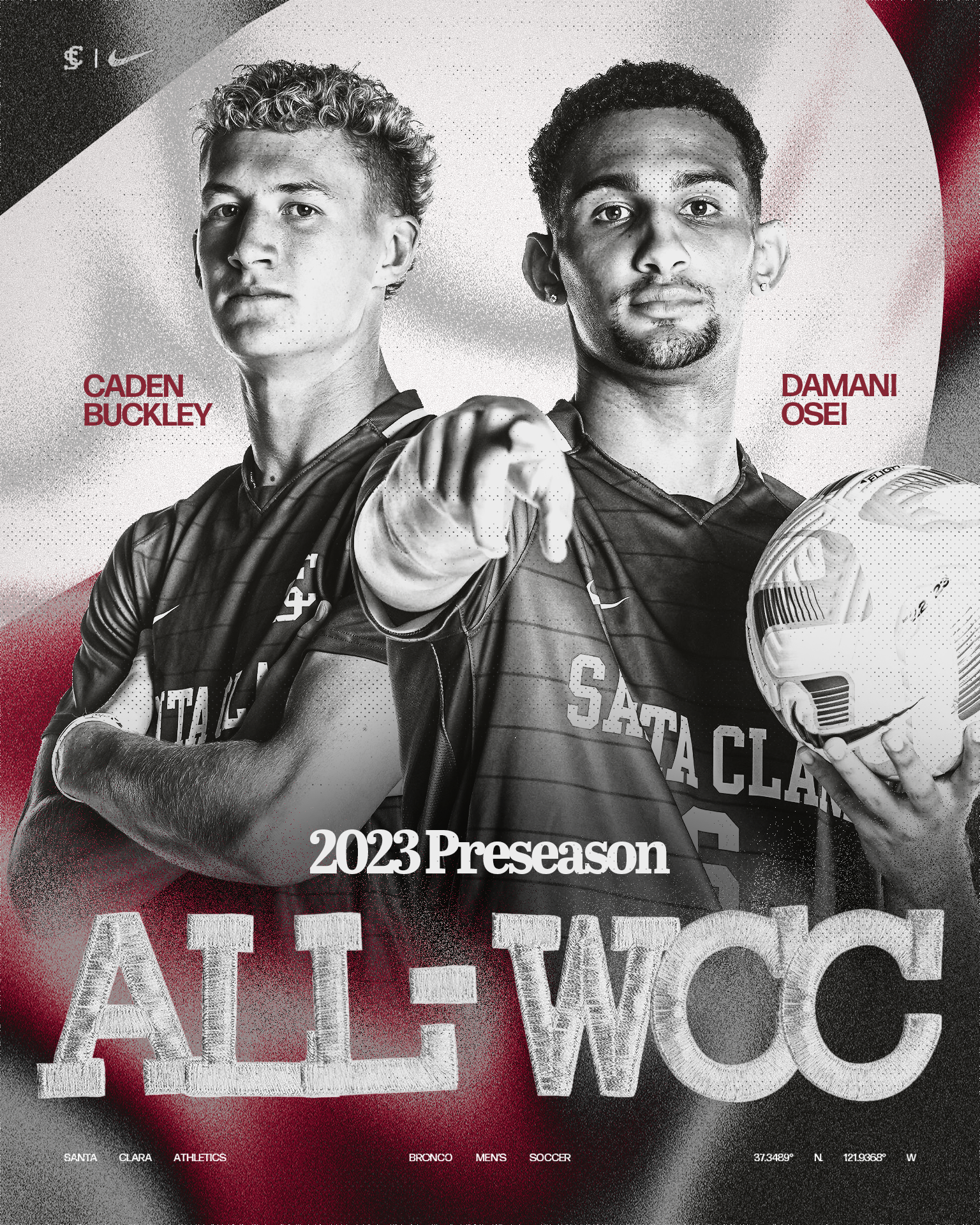
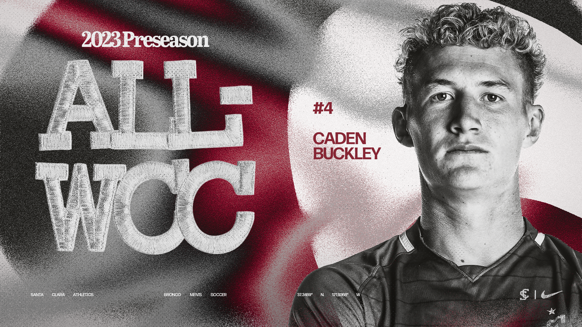
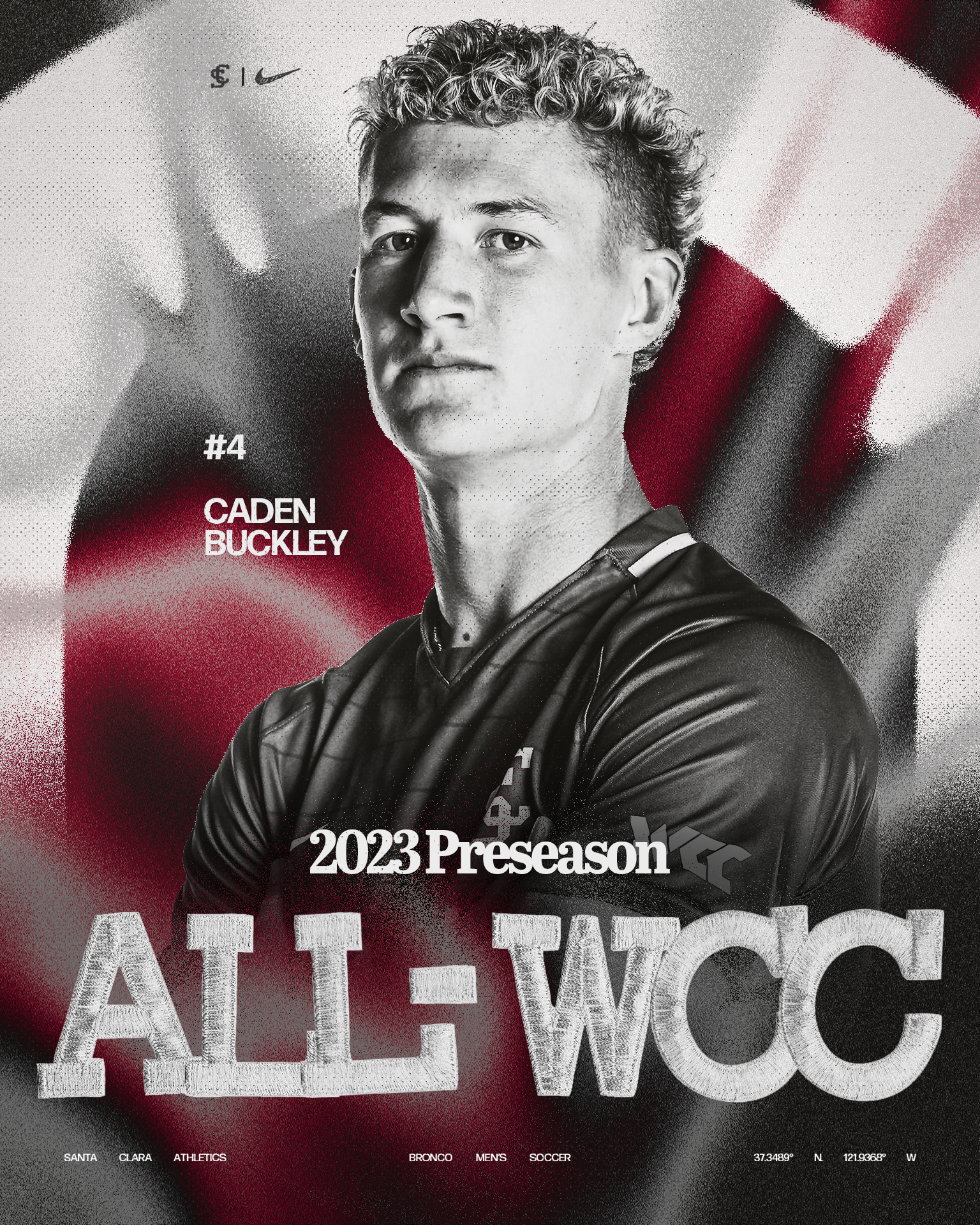
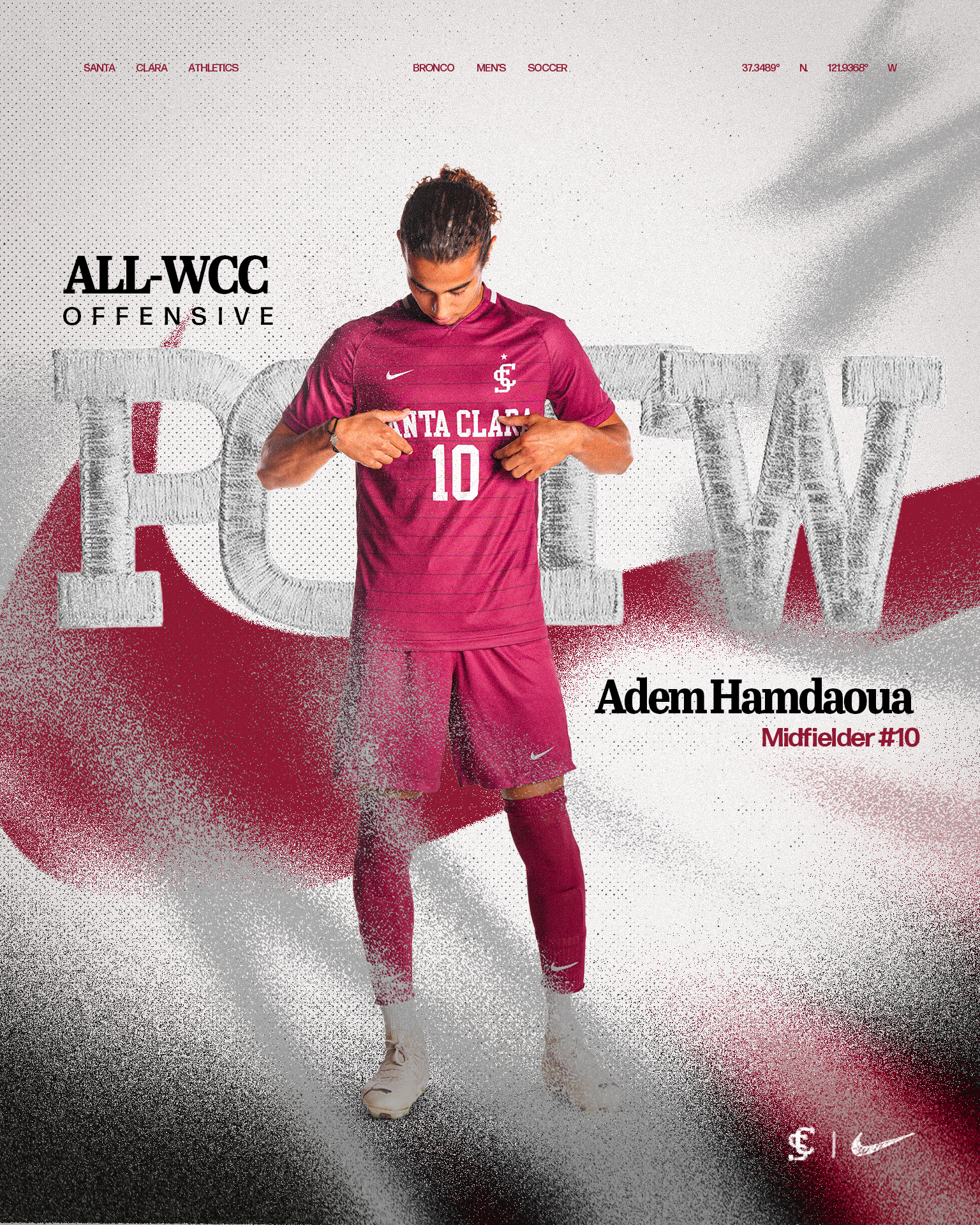
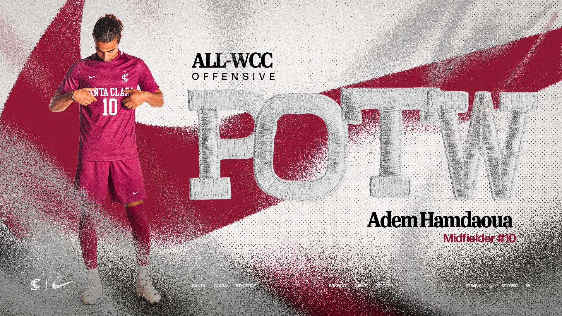
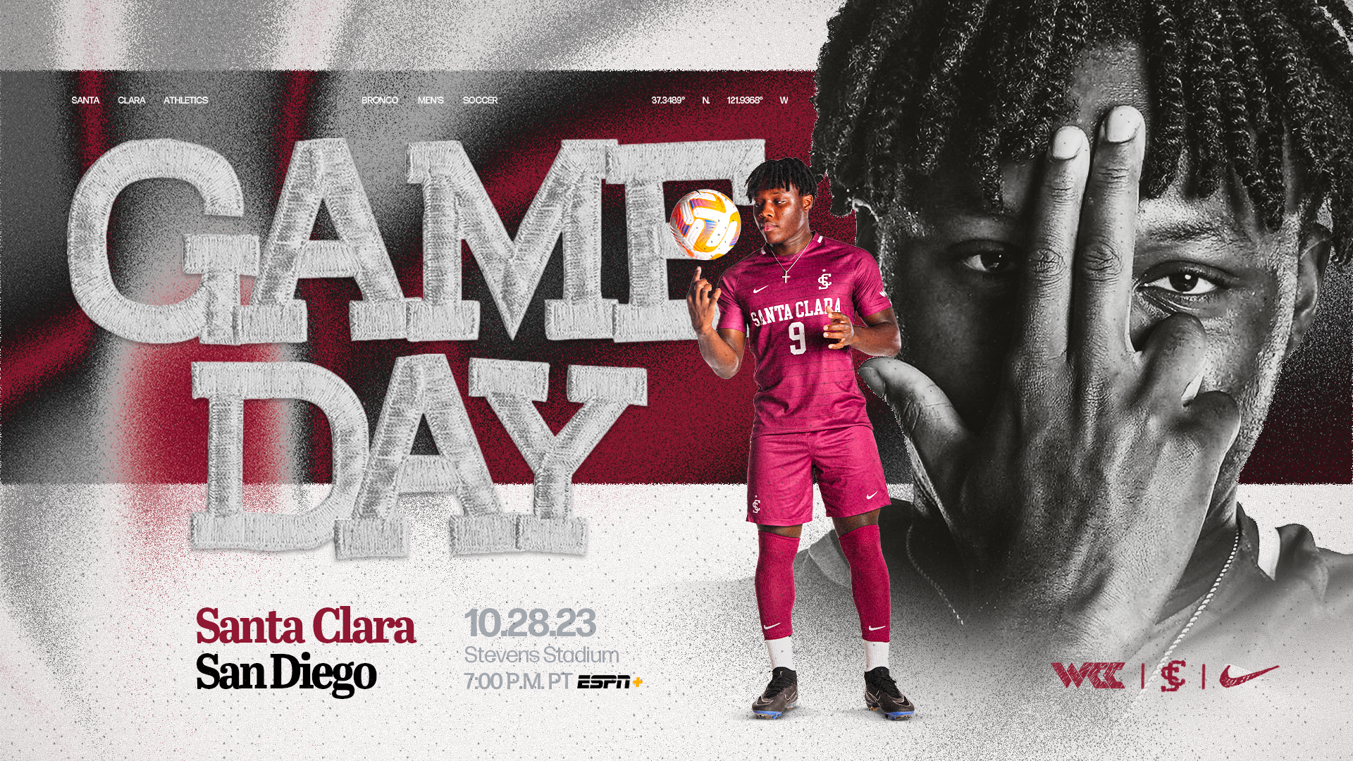
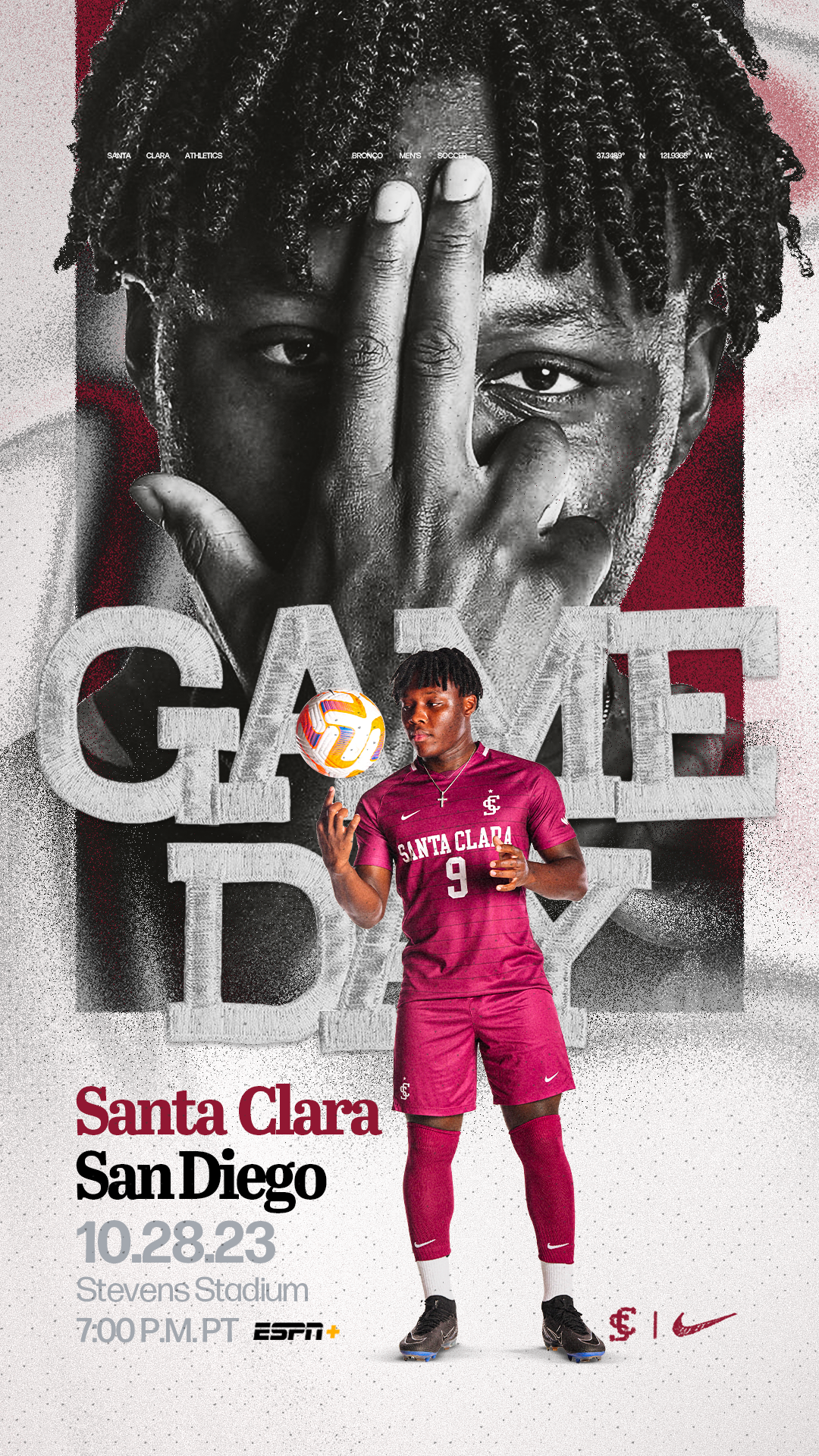
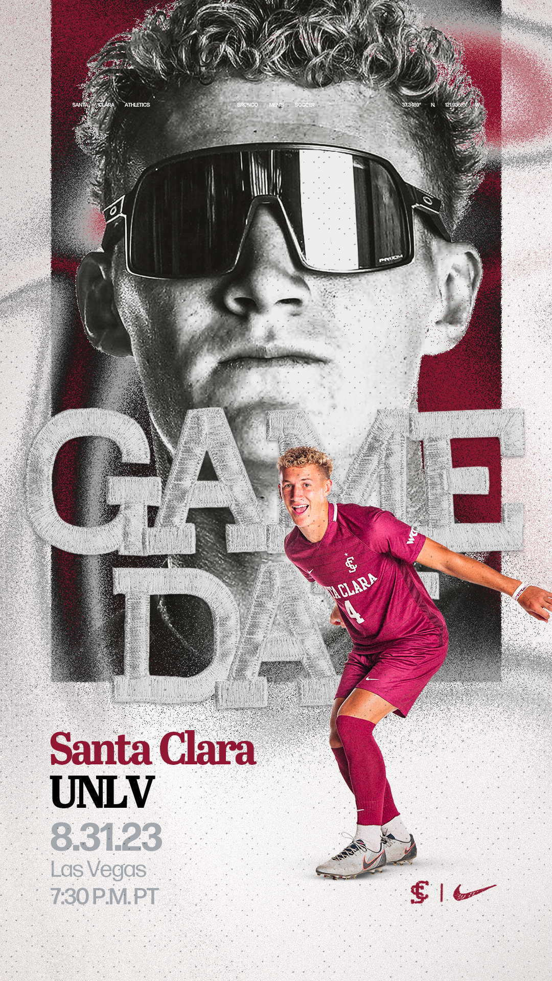
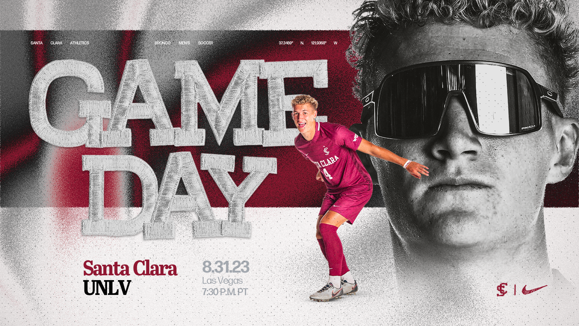
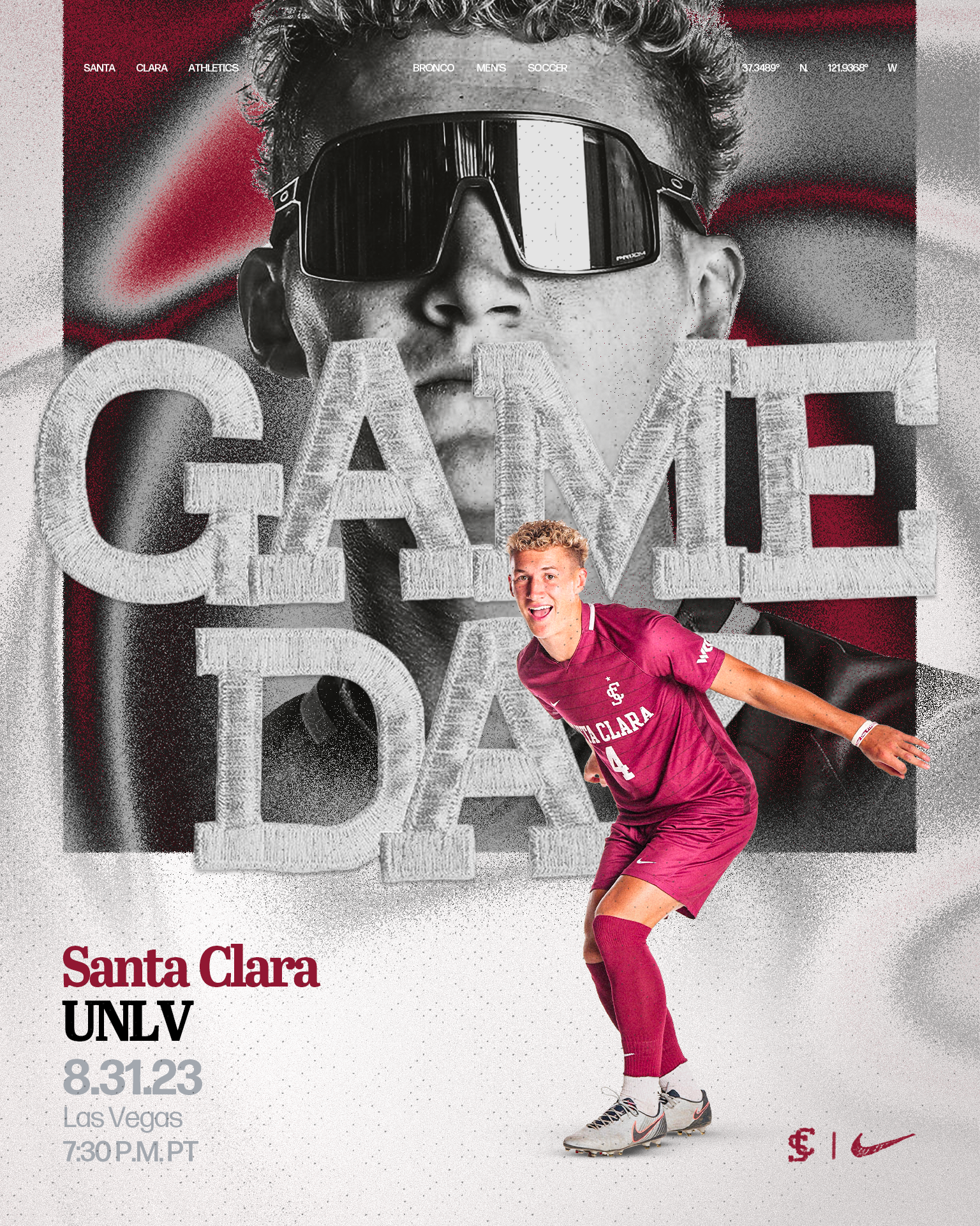
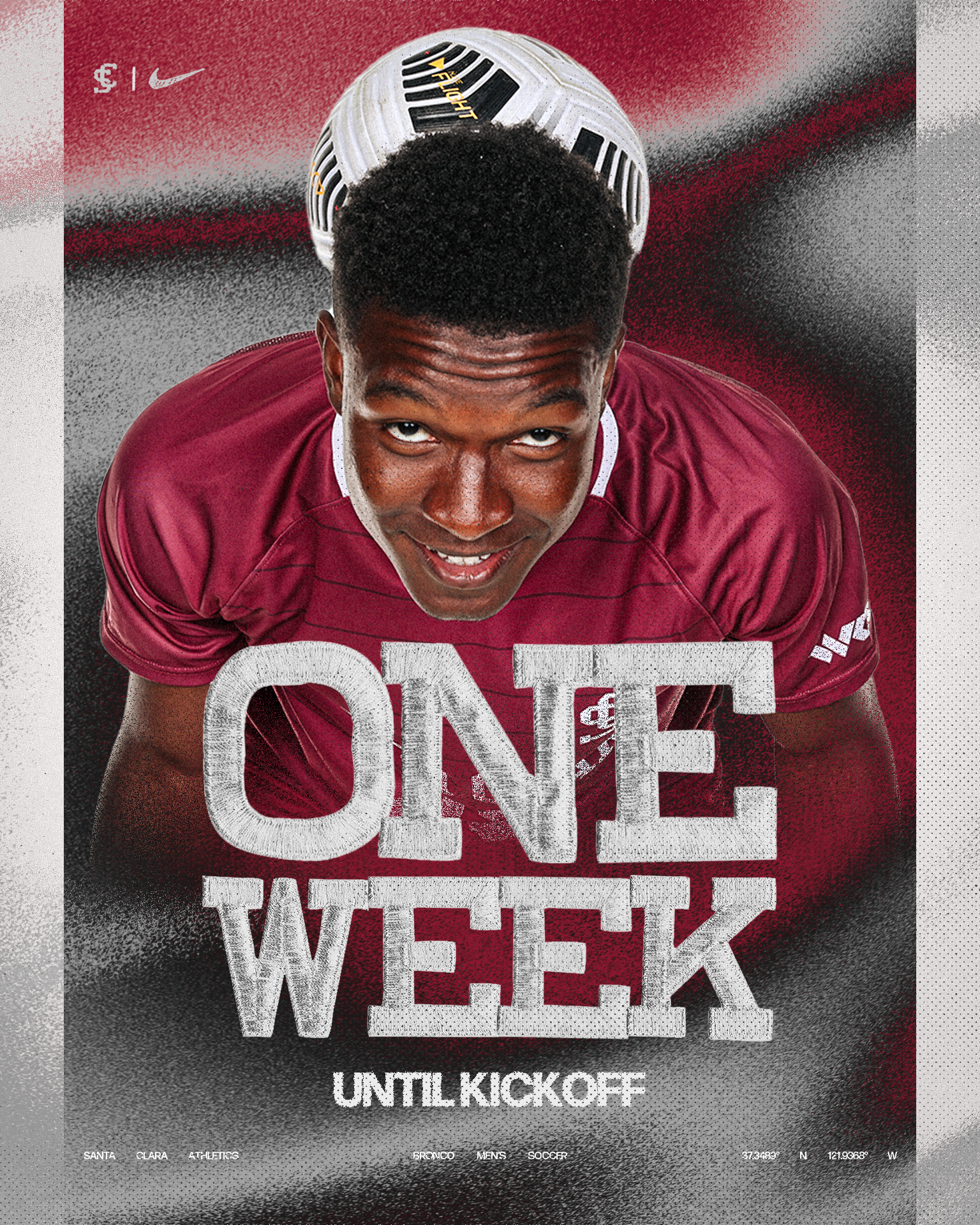
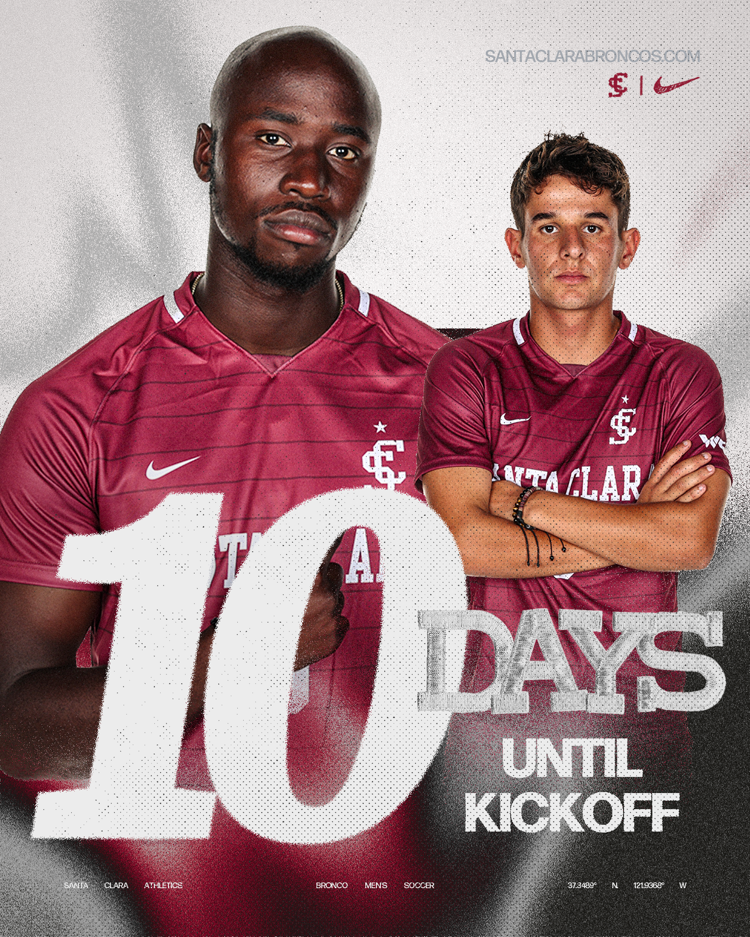
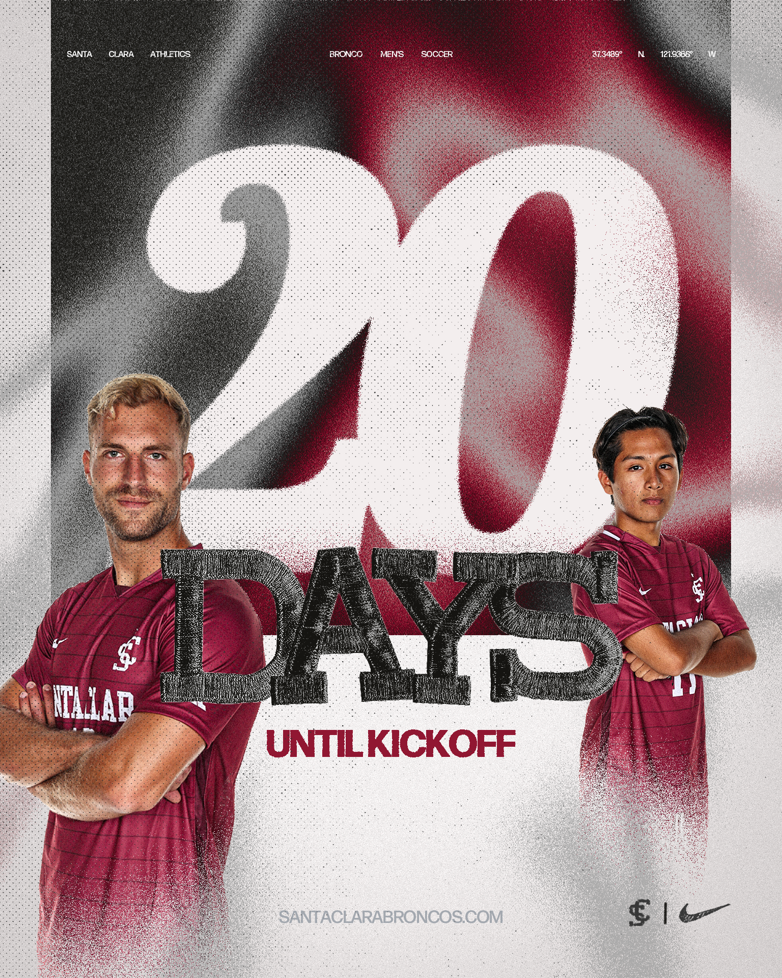
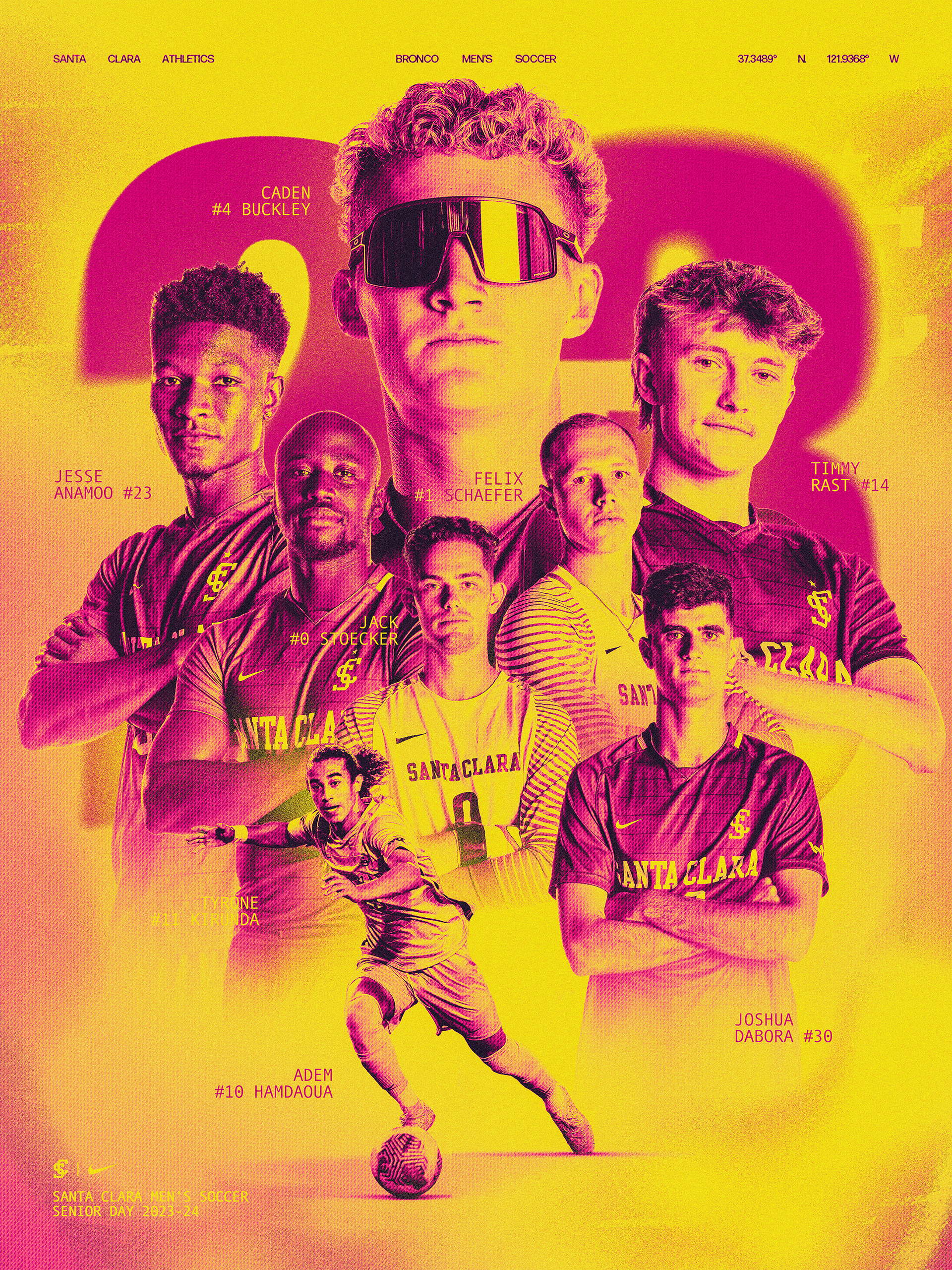
Building upon their colors, fonts, and 3D elements, I created a new visual look centered around harsh, grainy textures, halftone overlays, and high-contrast photography.
Contribution:
Creative Direction
Graphic Design
Visual Identity & Branding System
Awards
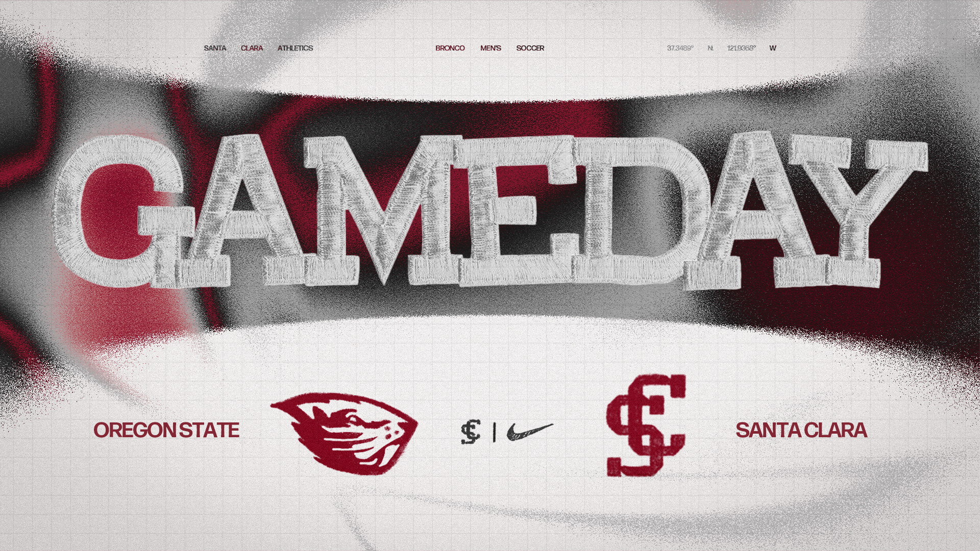
Gamedays

Templates
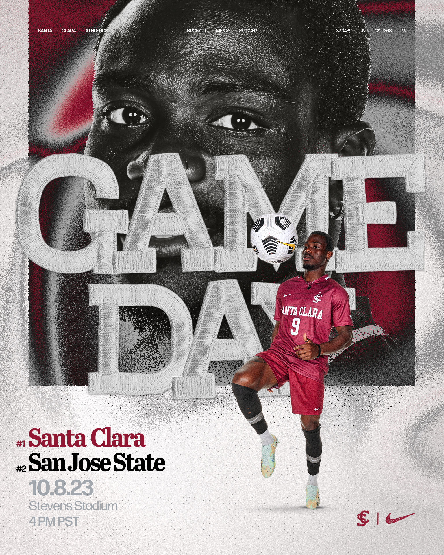
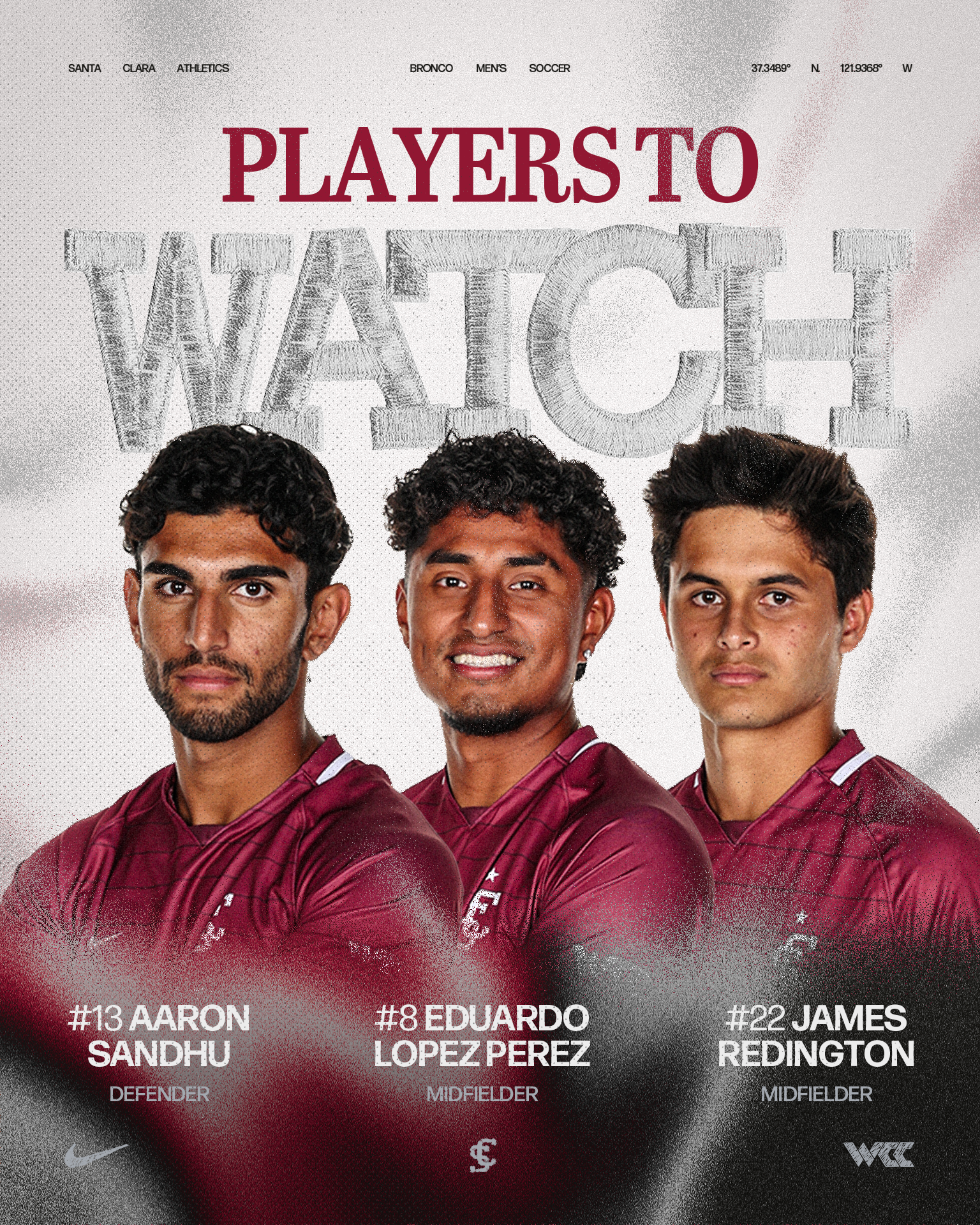
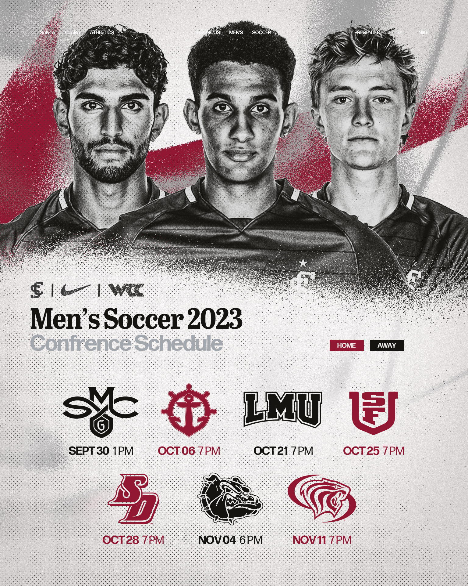
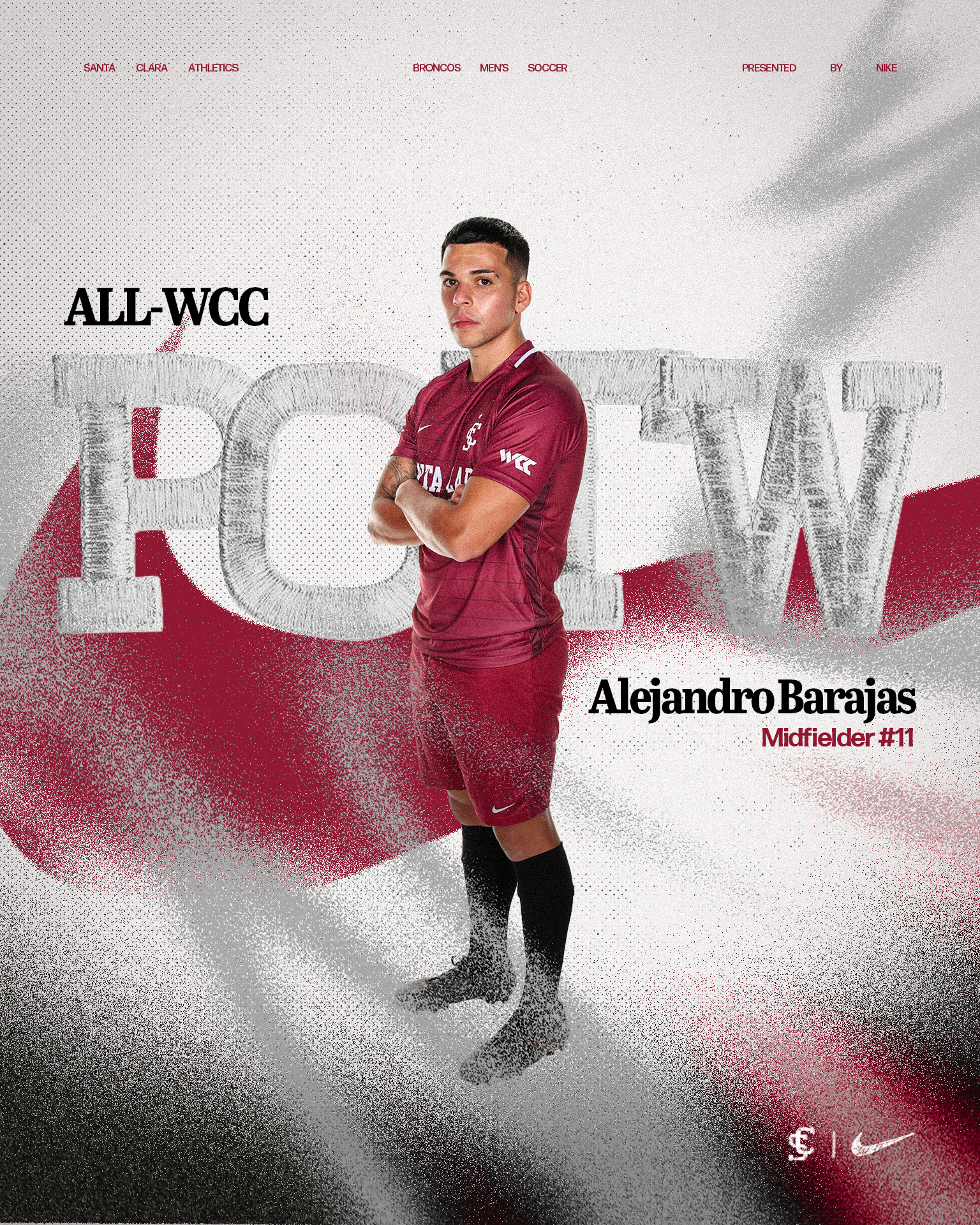
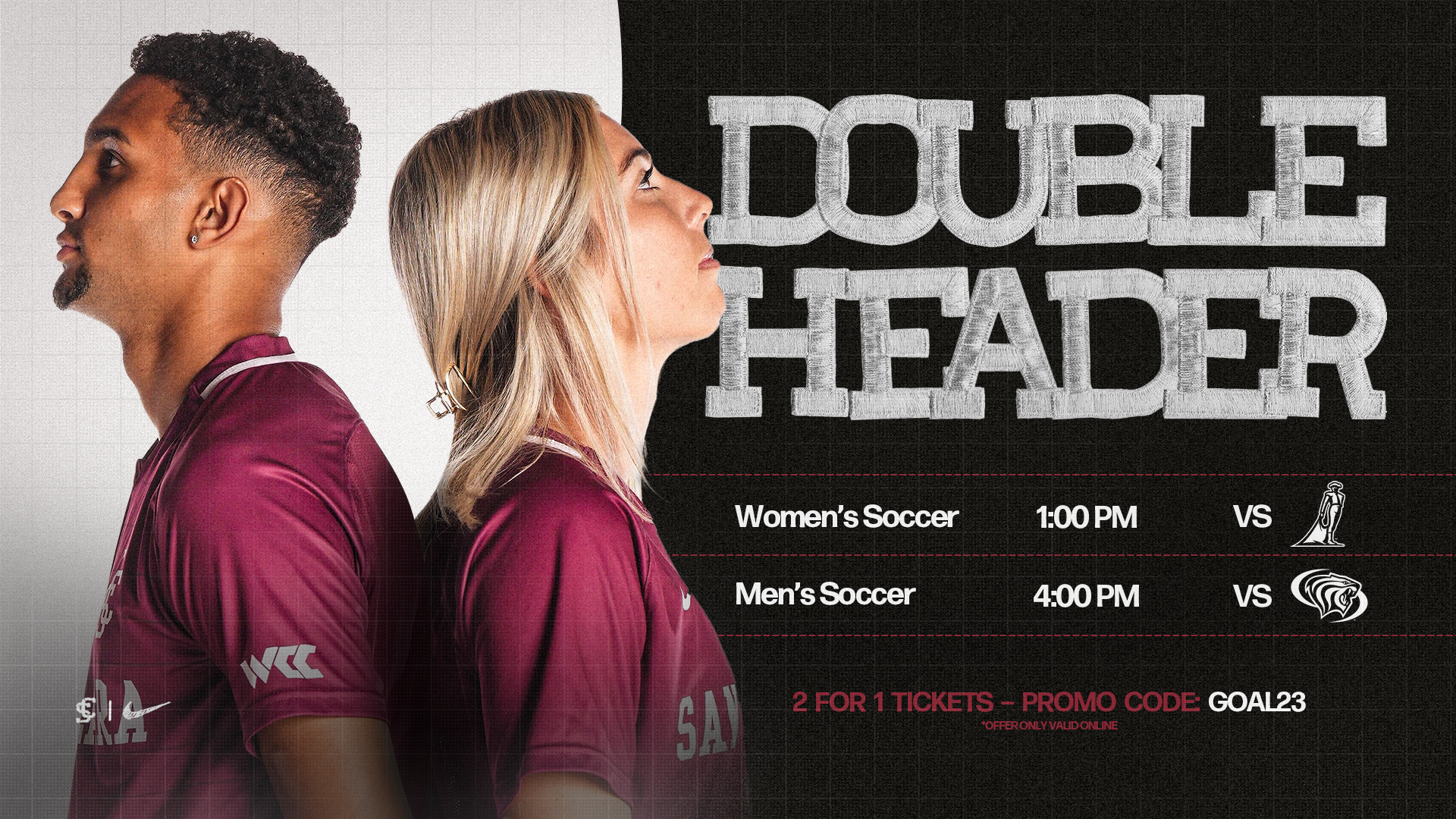
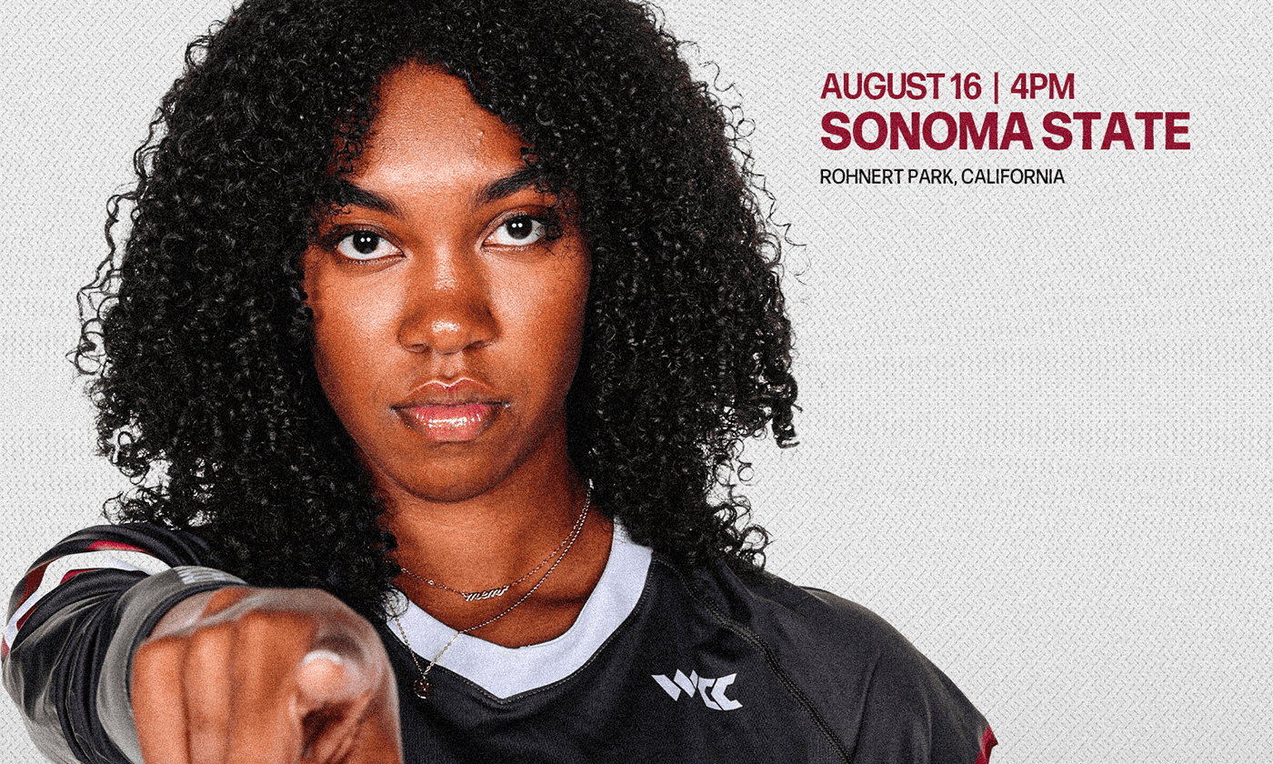
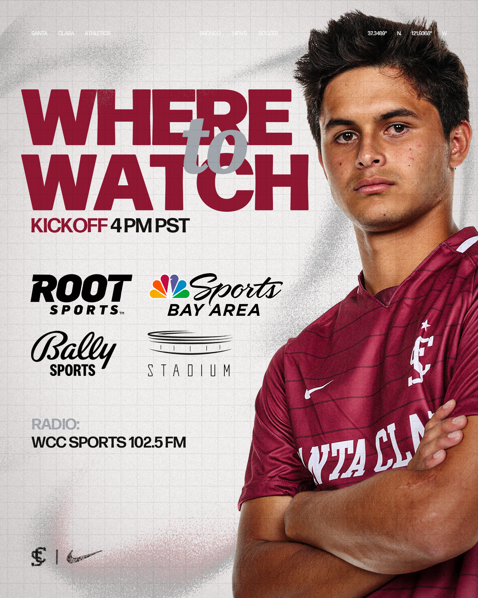
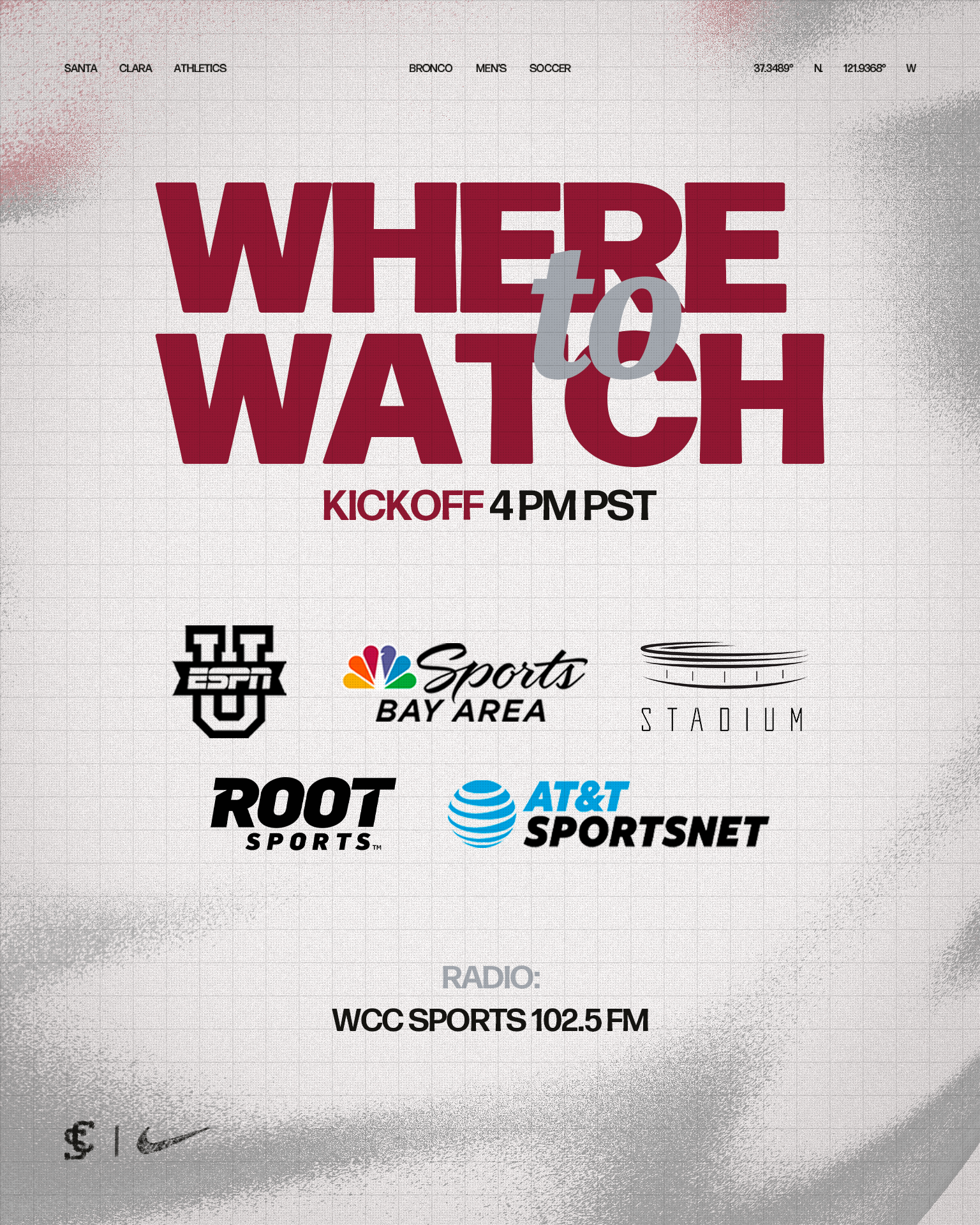
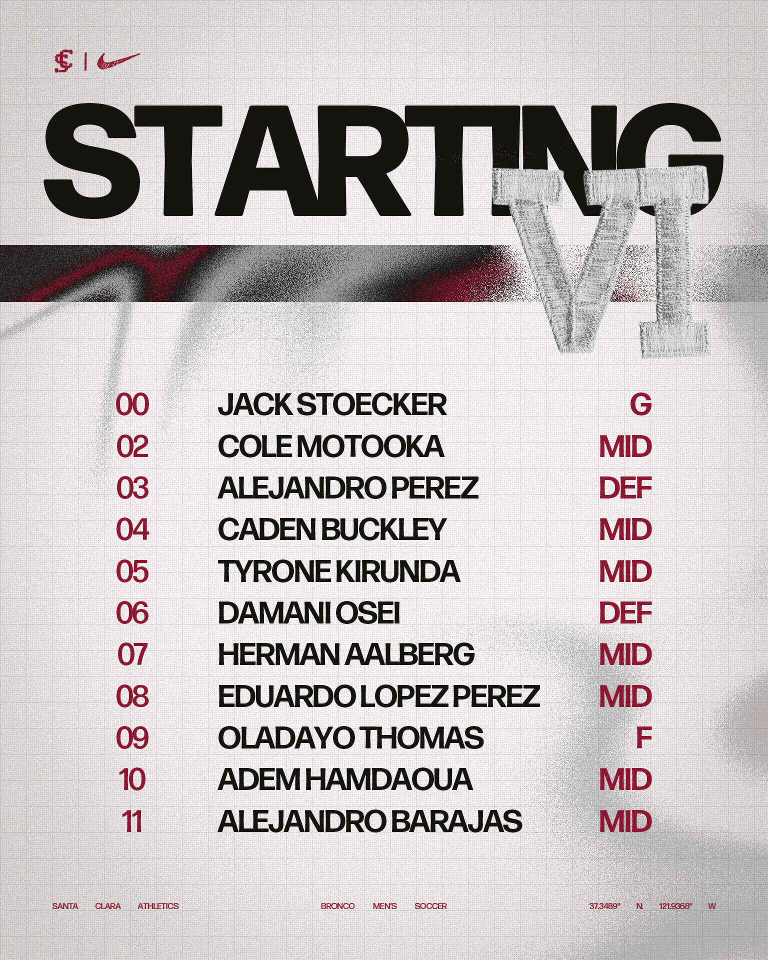
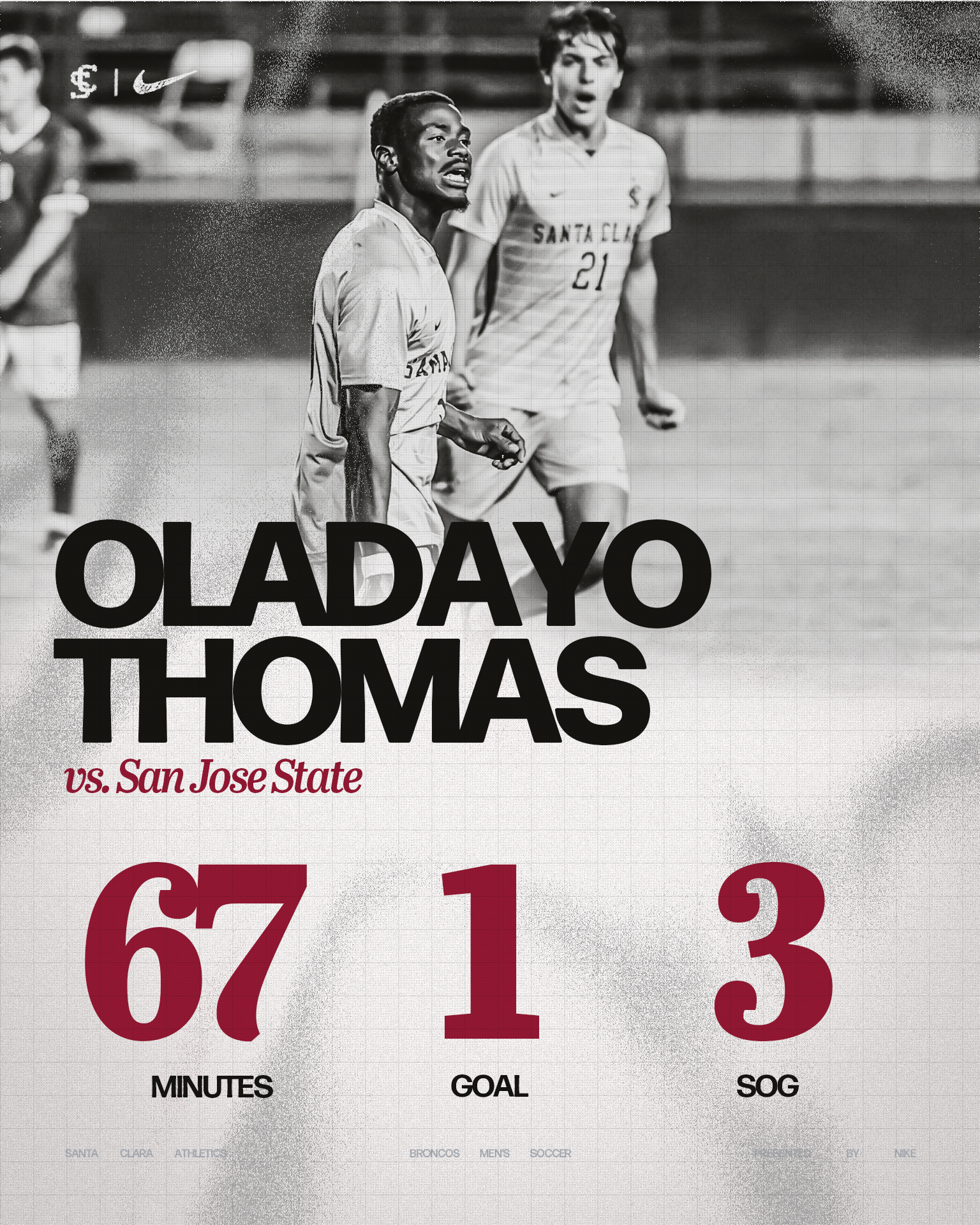
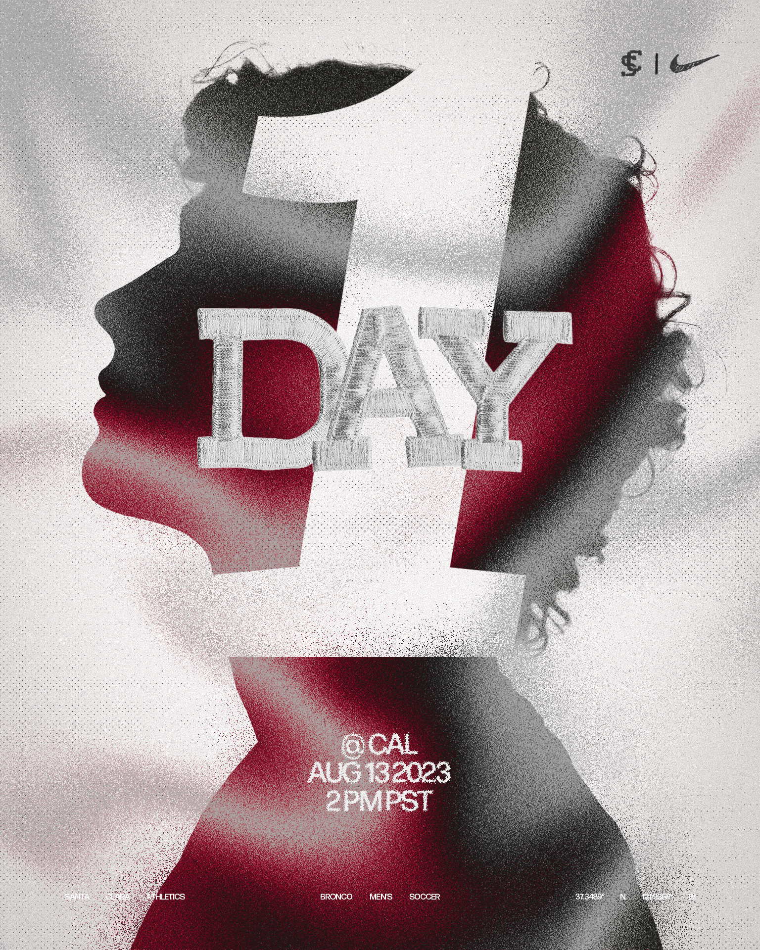
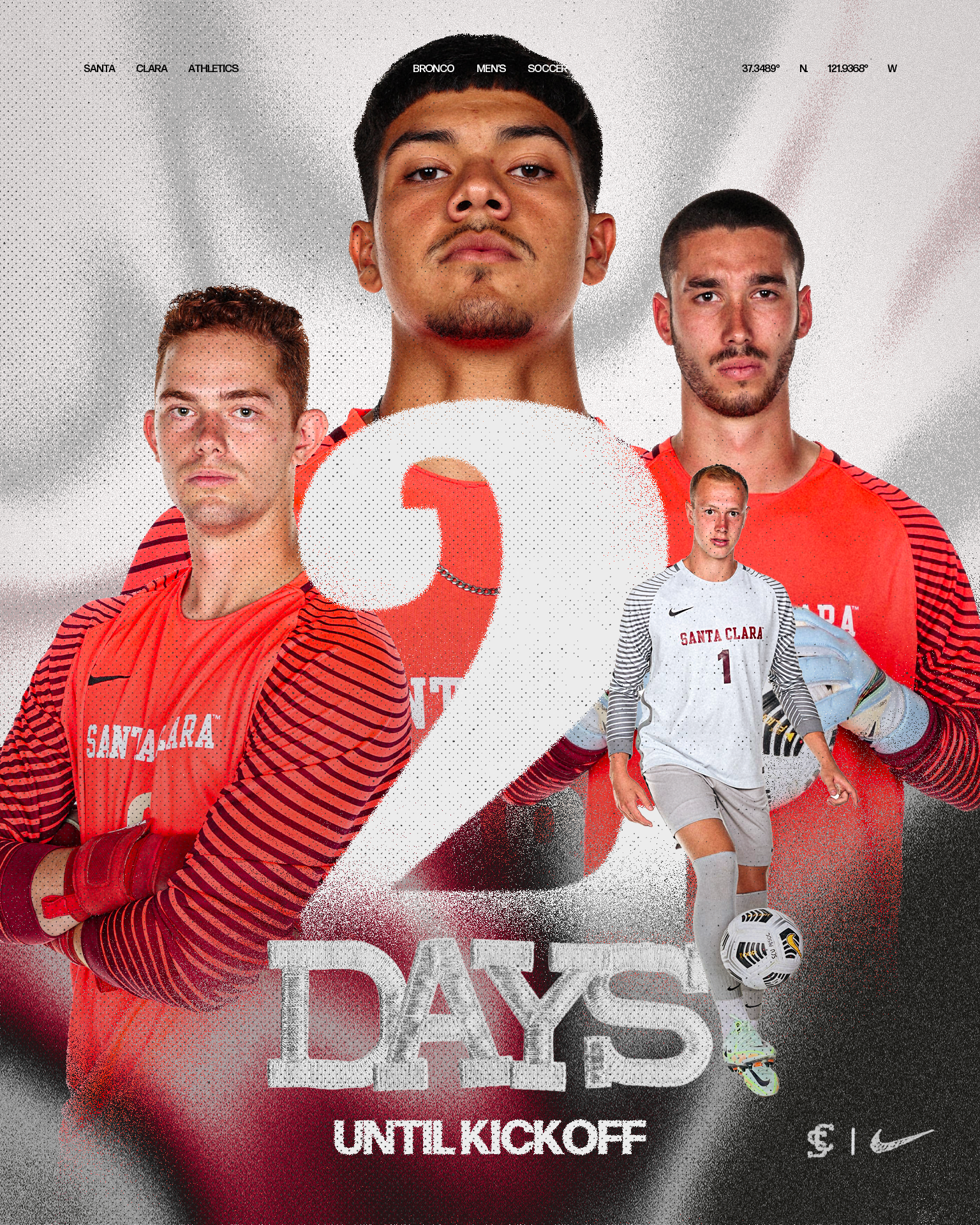
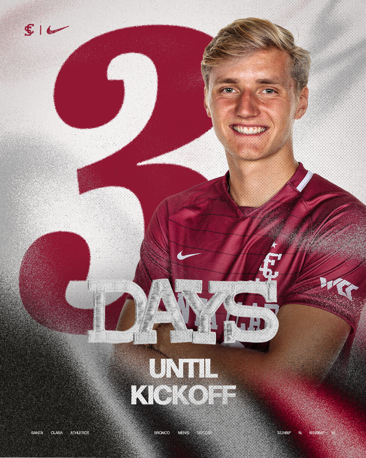
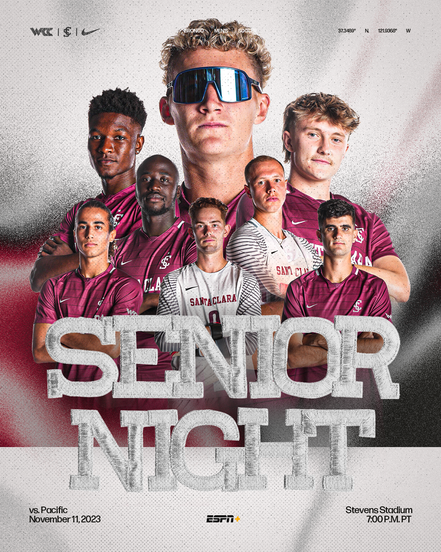
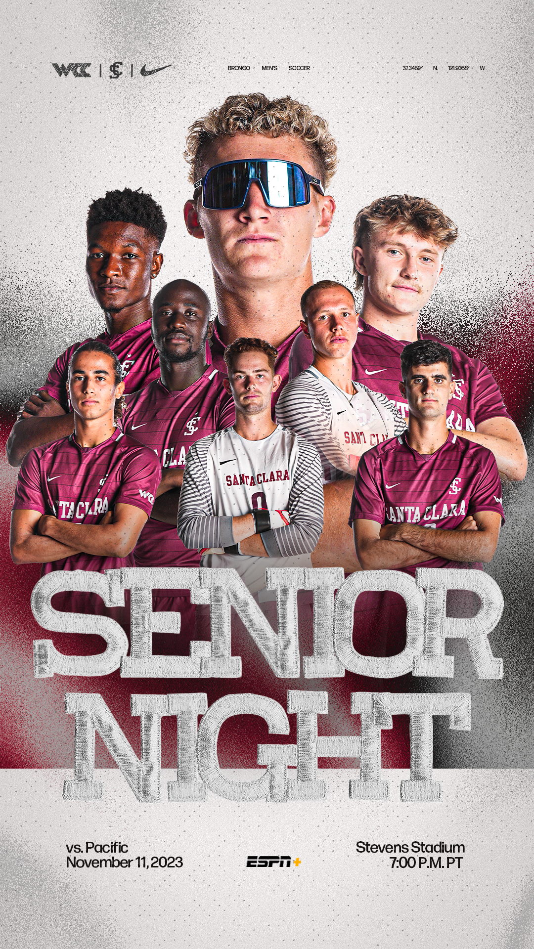
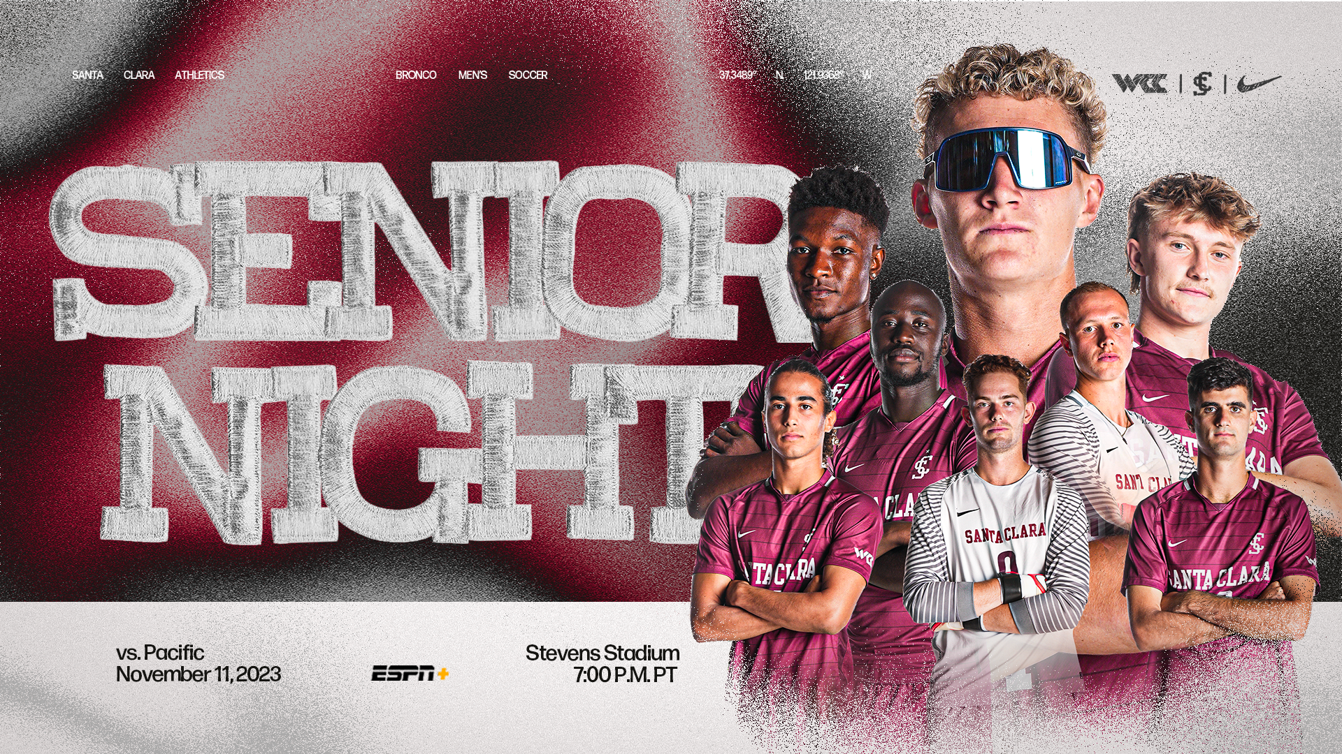
I divided the graphics for the season into two categories: "celebratory" and "informational" and used halftone and grid overlays to communicate the type of the graphic. This resulted in a psychological effect on the viewer, communicating the purpose of the graphic without explicitly stating it.
For example, a celebratory graphic could be an award or countdown, whereas an informational graphic would be to communicate information such as a stat line or game time.
Season Countdown
Senior Night
Marketing